For a long time we’ve been using a generic logo for Tainted Fate, looked something like this:

We held off on designing a new logo because we couldn’t decide on the name of the game. After all, Tainted Fate was only the code name of the project. It doesn’t have much to do with the story of the game. But it stuck. After much debate it was decided, the game would remain known as Tainted Fate. “It don’t mean shit, but it’s got a ring to it”.
As the game changed direction from a serious horror game into a slasher gorefest, the logo needed to reflect that. It needed to be less scary and more heavy metal.
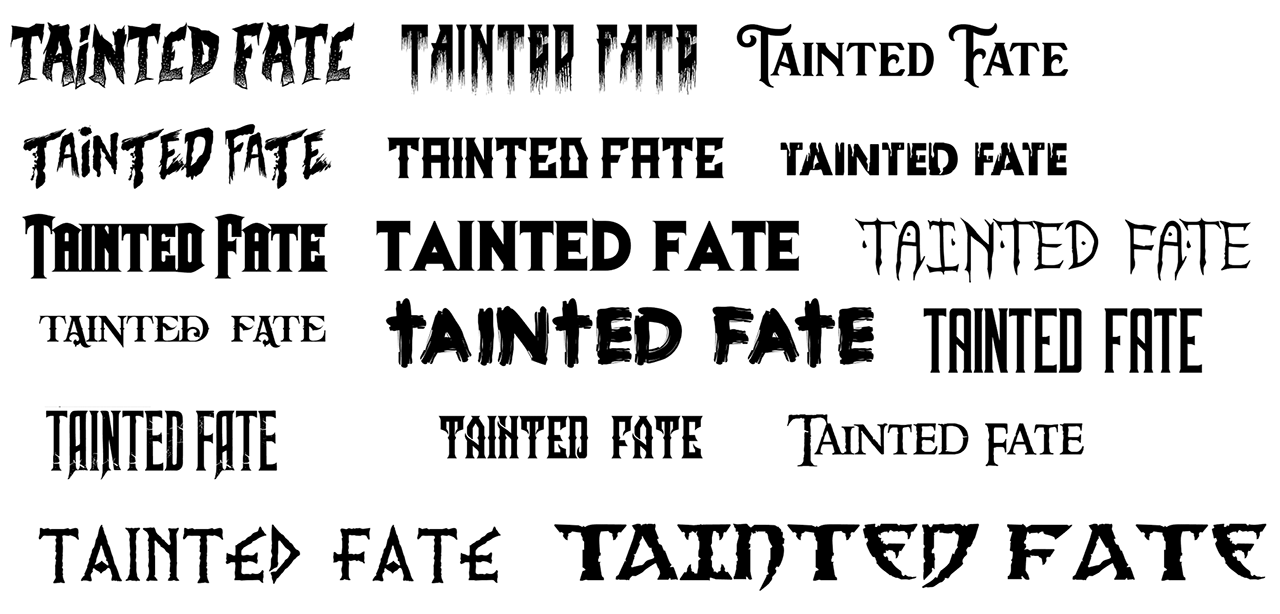
We went through a lot of potential fonts to see what fits:
After narrowing it down we contacted a designer we thought would be perfect for designing the logo – Maksimilijan Gečević.
He went ahead and proposed a few fonts and designs:

The Black Veil font (#6 and #8) stuck with us and we decided to go with it. After Max designed the first pass of the logo, we knew we were on the right path:
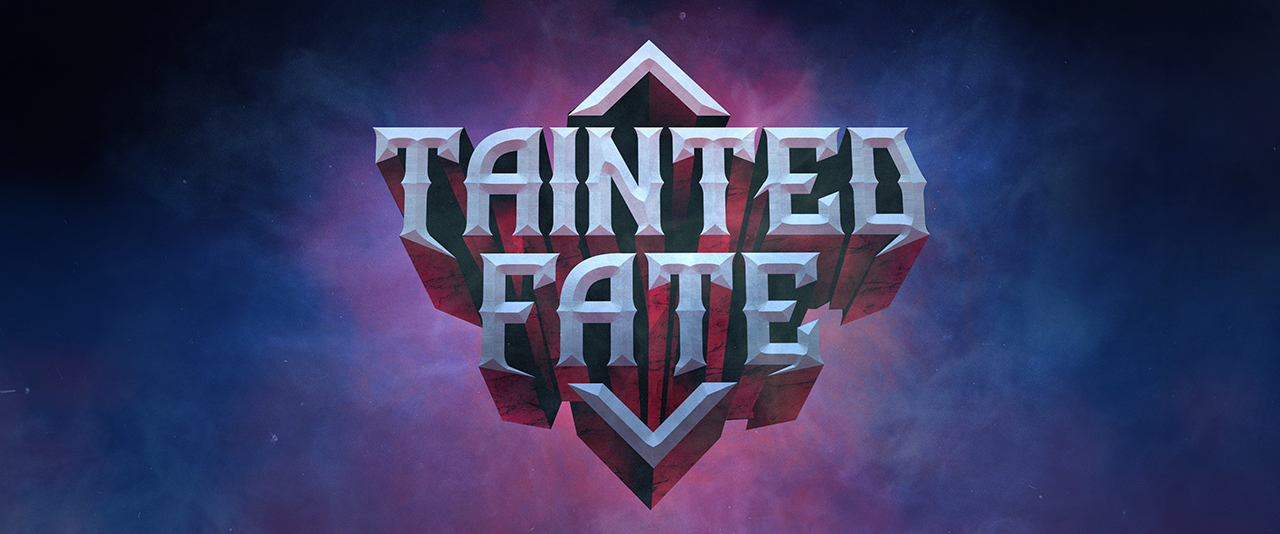
It just needed to be less “Guitar Hero” and more “Blood and Gore and Dismemberment and Satanic Cults”. So we went ahead and sent him the other extreme:
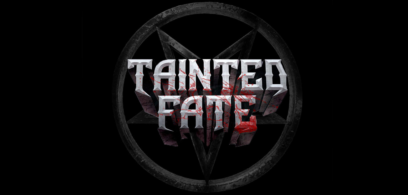
“Can you make it like this but without blood and change the pentagram to something else?” was our question. A difficult task for Max, but he pulled through:
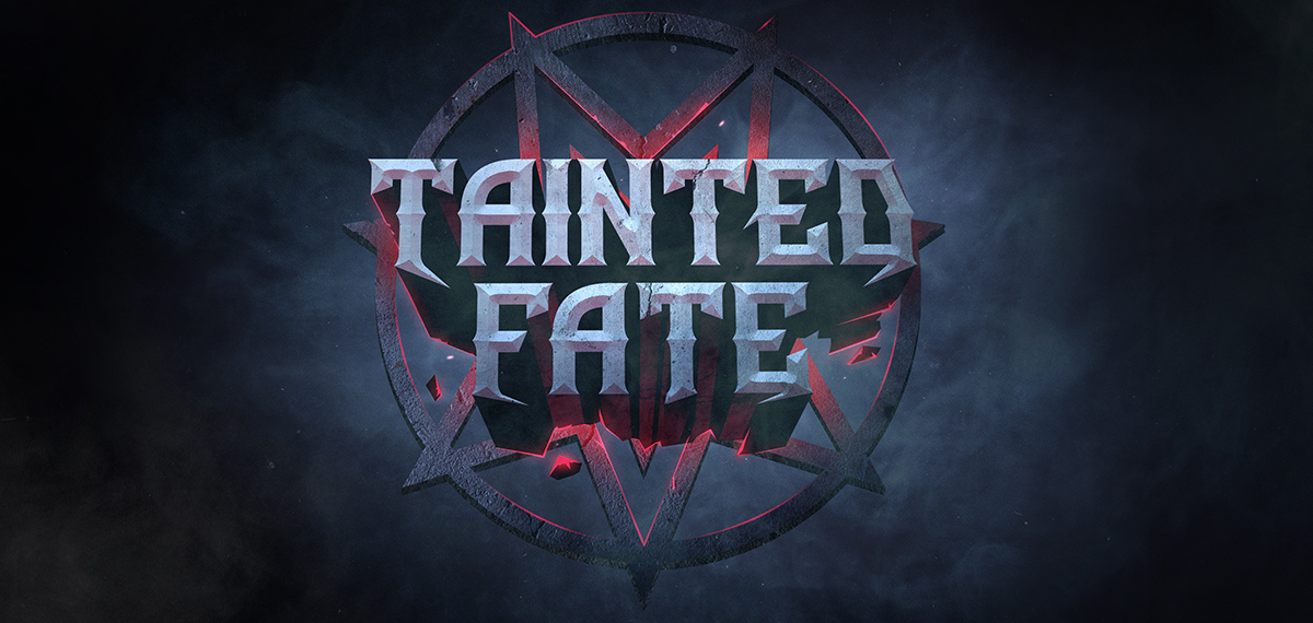
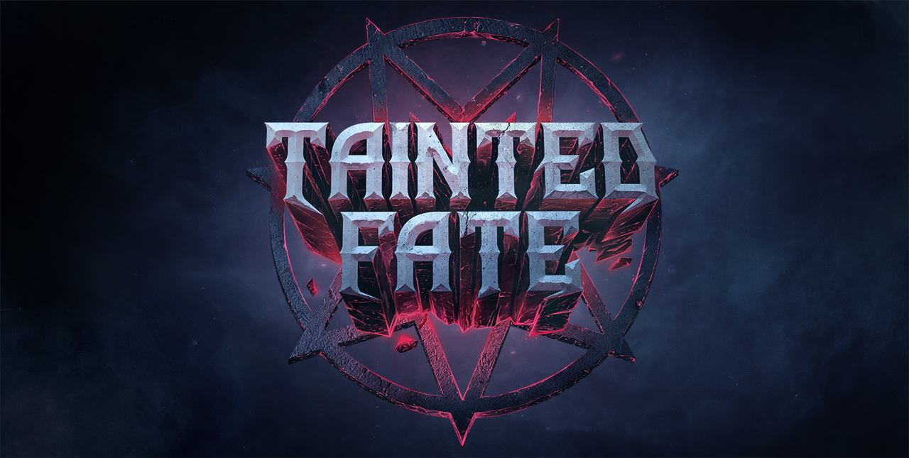
This was the base for the final logo. After a few back and forths, we ended up with the finished logo:
Expect to see this beauty all around the interwebs in the wake of Tainted Fate’s release.
Check out Maksimilijan’s instagram and behance page for more beautiful artwork and designs.

